Mongo Charts pivot table

I’m using charts on atlas to display summary data on a number of records.
Users are used to excel pivot tables so something similar to this is my aim.

image

The text table version shows the raw data.
Heatmaps is 95% of the way there, but only shows the value of each cell as you hover over it.
image

Is there any way to get heatmaps to display values in each cell? Or is there a better mongocharts way to show pivot table style data.

Hi @Neil_Albiston1 -

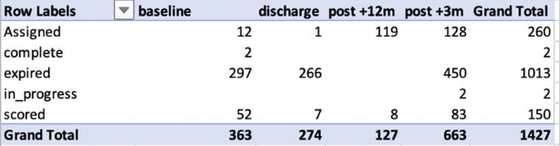
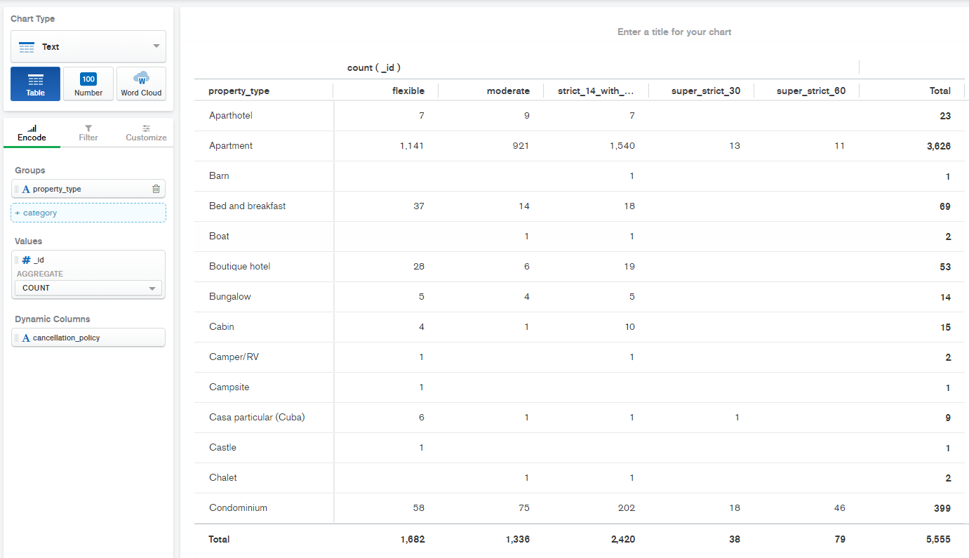
Yes you can do this with the Table chart type in the Text category. Please see the following example of a table similar to what you show.

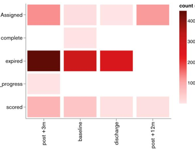
Note that we don’t currently have a way of shading cells in a table like a heatmap (I’m not sure if this is a requirement for you or not) but we will be enabling conditional formatting on tables later in the year.

Tom

1 Like

Perfect. Thank you.
The ‘count’ option on Text tables is exactly what I was looking for.

Neil

This topic was automatically closed 24 hours after the last reply. New replies are no longer allowed.