Help building column charts

I have a collection of member records that look like the following

{
    "status": {
      "active": true,
      "admin": true,
      ...
    },
    "firstName": "Sean",
    "lastName": "Campbell",
    "courses": [
      {
        "courseId": "some id",
        "courseName": "Working At Heights",
        "courseType": "SAFETY",
        "datesTrained": [
          "1976-05-11T08:19:05.000Z",
          "1987-04-12T10:29:45.000Z",
          "2019-01-12T00:00:00.000Z"
        ],
        "expiryWarningSent": false
      },
      {
        "courseId": "some other id",
        "courseName": "WHMIS 2015",
        "courseType": "SAFETY",
        "datesTrained": [
          "1974-01-02T22:47:37.000Z",
          "2017-06-30T14:24:18.796Z"
        ],
        "expiryWarningSent": false
      }
    ]
  },

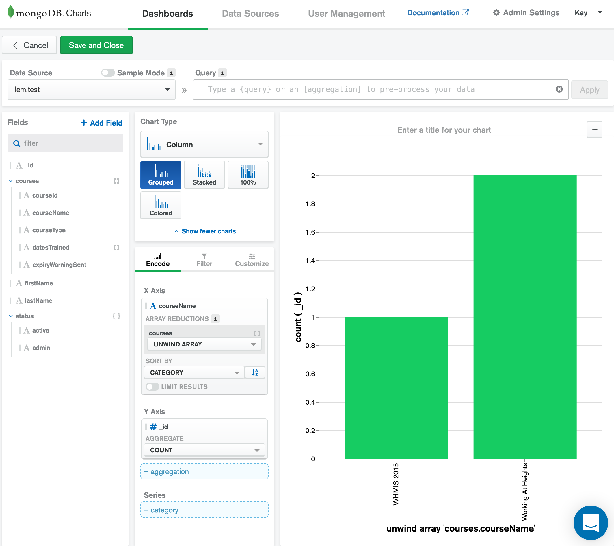
I am looking to build a column chart with MongoDB Charts that will show the number of members who have been trained in each of the courses.
Where the x-axis is the courseName from the unwound (unwind option with charts). But I cannot get the y-axis right. I am given the option to unwind the courses array, but cannot find a way to get the graph to display the count of datesTrained length greater than 1.

I have an aggregation pipeline that returns the values I am looking for from the members collection.

[
  {
    '$unwind': {
      'path': '$courses', 
      'preserveNullAndEmptyArrays': false
    }
  }, {
    '$match': {
      'courses.courseType': 'SAFETY', 
      'courses.datesTrained.0': {
        '$exists': true
      }
    }
  }, {
    '$sortByCount': '$courses.courseName'
  }
]

Any help is very much appreciated.

Why you want to count dates? Just count the _id

Is this something you are looking for?

1 Like

@coderkid

Your suggestion returned the same values. Which are different then what the aggregation pipeline is returning.
When the datesTrained array of any course is empty then the member has not been trained in the course, but they may have the course record since I am using that array (courses on the member document) to track other thing which may leave the datesTrained empty.

Then to complicate the situation more, in the future I would like to test the last dateTrained is not passed the expiry date, which I would like to calculate based off a different collection, the courses collection. Which I am not sure if Chart will be able to do…

Hi @Natac13. When you have unusual requirements like this, it’s often useful to preprocess the data with your own custom aggregation pipeline. You can take the pipeline you’ve already written and paste it directly into the Charts query bar, or if you want to build multiple charts with this data you could save the pipeline against the data source.

Does that work for you?
Tom

2 Likes

BINGO!!

Thanks @tomhollander, I just copy and pasted my pipeline above without the $sortByCount stage. Then using the suggestion from @coderkid I did x-axis courseName and y-axis _id and the chart looks beautiful!

2 Likes