But I’m experiencing and issue and while have searched for the same issue but haven’t found it.
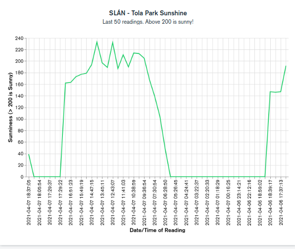
My problem is that while my value (Y-axis) over time (X-axis) line graph looks right the time labels are jumbled up. This doesn’t happen if I render the same data as a text table. Have I done something daft?
Ah I think the line graph is in ascending value while the text chart is in ascending date. Hopefully I’ll find out how to fix this and remove this post Again I’m new to Charts.
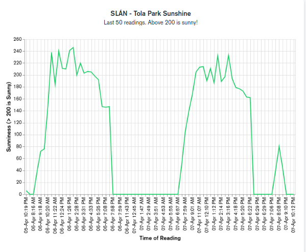
Solved it. Needed to select CATEGORY rather than VALUE for the X-axis. Still writing this got my to focus on the problem and may help some other newbie
Great stuff! Note that it only defaulted to the Value sort because your X values are strings. If they were dates, it would always show them chronologically, and also unlock additional options such as Binning.
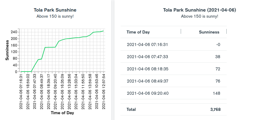
Even if you can’t change your data to use the correct Date type, you can still convert the field type directly within Charts. Just click the … button on the field in the left panel and choose Convert Type.
Thanks for that explanation. I’m almost there now I’d just like the graph to show the oldest on the left not the newest of the the last 50 readings. Any suggestions?
If I reverse it I get the first 50 readings and if I don’t limit to 50 my graph is too big.
I tried writing a query to limit the data to the last 50 but that didn’t work for me.
Again, the solution is to use the a Date type on your X axis, either by modifying your data or using the Convert Type option on your existing string field.
Once you do that, you will be able to use the Filters tab to create a filter on your last field, which could be something like Last 1 Day (or whatever time period you want).
 Again I’m new to Charts.
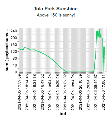 ow looks good!